As the campaigns for the 2022 Australian Federal election continue, people are starting to make up their minds about who should get their precious vote. However, if political party websites are inaccessible, there is a significant risk that people with a disability may not have the same opportunity to make an informed decision on how to vote.
To find out where parties stand on digital access, the Centre for Accessibility Australia’s’ lead auditor Chris Leighton and CEO, Dr Scott Hollier, recently led an auditing team to test a number of websites related to the upcoming Federal Election to determine their accessibility. Is your favourite party accessible? Let’s take a look at how easy it is to find the critical information across a number of parties and the Australian Electoral Commission (AEC).
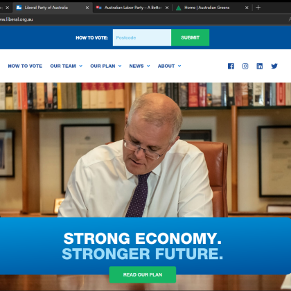
In no particular order, we first have the Liberal party website. User testing suggests that this is a difficult website to use. There are significant colour contrast issues within the use of white on green for buttons. There is a lack of alt text on images, and there are unlabelled buttons and forms featured on the page, along with a scroll-over menu at the top of the page that breaks hover-focus rules. The website does contain accessible links, however, in its use of its ‘Media Release’ buttons.
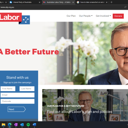
Next is the Labor Party website. While user testing suggests that basic navigation is possible, there are keyboard focus issues, along with empty buttons and links. Some web forms contain placeholder attributes rather than proper labels, with social media files having the same issue. There are also two issues with the button system, with one being the use of photos for the button backgrounds, impacting on colour contrast, and the other being the use of a non-descriptive ‘Read more’ button.
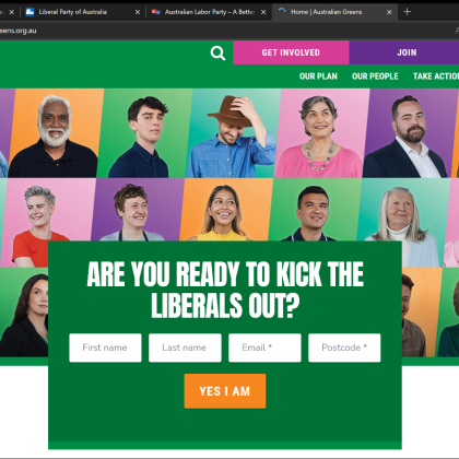
The Greens Party website is next which user testing suggests is quite difficult to use. The website contains numerous colour contrast issues, including a white on orange colour scheme that doesn’t have enough contrast, and a light green and white colour scheme that also has a lower contrast than is accessible. The website also uses a non-accessible drop-down menu that disappeared when focus is lost, creating an issue for screen magnifier users and people with a mobility impairment.
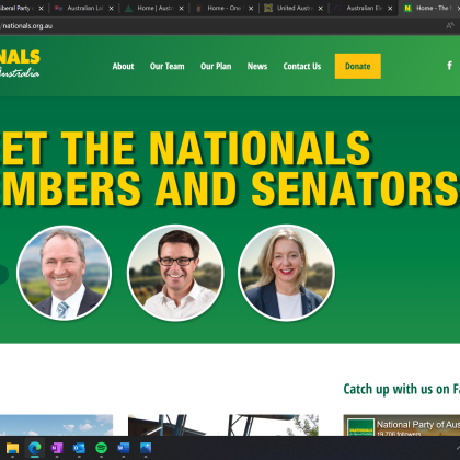
The Nationals Party webpage has some issues but user testing was mostly able to find content. The website contains a scrolling carousel menu that doesn’t contain controls, making the page difficult to use for people with vision, motor and cognitive disabilities. The page also contains non-descriptive links such as ‘read more’ which makes the website harder to use for screen-reader uses.
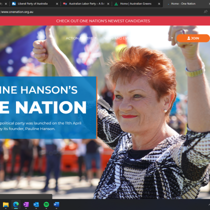
A challenging website in our user testing was the One Nation Party website. Issues include a moving background video that doesn’t contain controls either. Along with creating difficult colour contrast as the background colours are always moving. Not all headings are correctly nested, and an embedded Twitter feed creates difficult to use links.
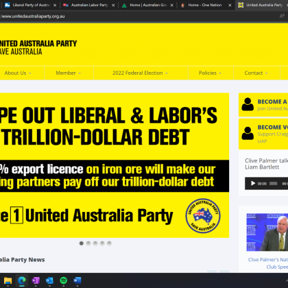
Finally, we have the United Australia Party which was considered by our user testers to be the most difficult. The website contained undescriptive links and buttons such as ‘Read more’ among a greater issue of colour contrast with a total of 273 tested errors. The page also contained a scrolling carousel without pause, stop or hide functionality, along with a non-accessible drop-down menu system that creates difficulty for screen-reader users.
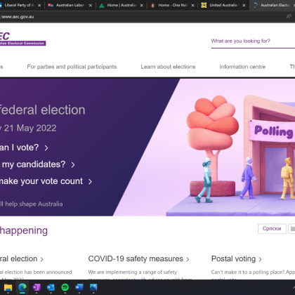
On the positive side, user testers found the best website was the Australian Electoral Commission. There are, however, a few issues that have crept in such as the horizontally scrolling system that makes certain content undiscoverable to accessible tools. The website also has a reading age of 19.9, which could be reduced to increase accessibility for people with learning disabilities.
While some websites are better than others, the takeaway message is, that all political parties have some work to do to improve their website accessibility. The good news though, is that many of the issues identified are relatively easy to fix, meaning that with a little bit of work accessibility can be restored. As a result, we may only be one election away from giving all voters with disability greater independence in selecting their candidates. As a great post-election initiative, CFA Australia calls on all political parties to address the issues present and we’re happy to support that process. Perhaps we’ll even see some of them nominated for the Australian Access Awards once the issues are fixed.