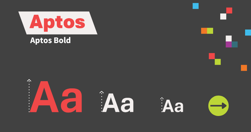
 Accessibility in typography and fonts is based upon different factors, including readability, legibility, and versatility, across many different platforms and mediums. Since the release of Microsoft Office in 2007, Calibri had been the default font in Microsoft Word, but after almost two decades has been retired as the standard and replaced with Aptos.
Introduced in 2021, Aptos was developed by Steve Matteson whose design catalogue also includes other fonts such as Cambria and Curlz. Aptos derived inspiration from classic Swiss typefaces of the mid-20th century, with hints of Helvetica and Arial fonts in its makeup.
While Calibri is seen as accessible, and indeed, in the top 5 of accessible fonts, Aptos stands out, particularly with its readability in design. Some of its accessible features includes horizontal and vertical lines that improve upon the slanted strokes found in Arial. This extends to individual characters, such as the modified “a” and “e”. There is also the inclusion of a double-story lowercase “g” with an angled stem. The accessible design also extends to punctuation, where circular dots appear as opposed to the sharp-edged equivalents in Arial and Helvetica.
The bundled Aptos fonts comprises a catalogue including Aptos Light, Aptos Display and a modern style serif font, Aptos Serif. To find out more about this update, please read Microsoft’s overview of Aptos.
